A new look that changes but stays the same for at least five years. That was the brief for the Summer on the Hudson Festival.
Summer on the Hudson at Riverside Park is an annual outdoor series of arts and culture events: music concerts, dance performances, movies under the stars, DJ’ed dance parties, kids shows, wellness activities, and more. In 2011, the festival needed a new look and graphics. But as with many nonprofits, the future design budget for the festival was minimal. So the new look had to be adaptable — enough to be different, but stay recognizable — over five years.
Kerstin created an illustration of the beautiful park highlighting its most important features for the festival: the river, the greenery, dancing figures, and a movie screen-like background for the logo. Updating the design each year was a matter of changing the color scheme. Plus, each component of the design – like the iconic river – could become the central element as needed for different marketing materials.
The system worked so well that Summer on the Hudson kept the design for 8 years, instead of the planned 5!
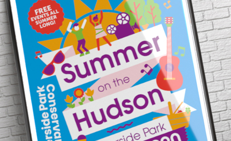
Flash forward to 2019: once again, the brief had a similar directive. Design a look that was, of course, eye-catching, and could be adapted for another 5, or maybe 8 years. The team still loved the logotype and since it was already printed on tents and banners, it was kept intact. This time around, Kerstin created a new summer motif with a roster of icons that represented the various kinds of events at the festival. These icons can be rotated in and out each year depending on what type of event is featured. The event brochure has a new book-style layout and a pictorial calendar, and banners reflect the popping new design as well. And, as advised to not fix what ain’t broke, this design too changes the color palette every year.
CLIENT
Summer on the Hudson
PROJECT SCOPE
New identity and brandmark, marketing materials (print and online), park banners, event signage.
TAKE AWAYS
- Iconic illustrated elements that come together as a design system — which can be updated using color and icon modifications.
- The colorful, fun illustrations that represent the variety of activities available are used as a mix-and-match to draw attention to each kind of activity when needed.
- Cohesive transfer of motif from marketing materials to large-format graphics.
- End-result: A design so successful it outlived its original time frame!
A Design System That Goes On, and On
Part of what 501c Design does so well is anticipate a nonprofit organization’s future needs. In this case, it was figuring out how to design a system that could be updated on a reduced budget. The first design system — with its illustrated elements — was easily modifiable. So much so that it was used for 8 years instead of 5! Each year, 501c was able to easily update the marketing materials at a minimal cost. Following the success of the first system, NYC Parks’ Summer on the Hudson had Kerstin design a similarly adaptable new system in 2019. Who knows, this one may last even longer!
Do you need a new look, but need to be mindful of future budget considerations? Let 501c Design create a roadmap for your design needs and develop designs that are flexible enough to get you through your budgetary constraints.
“Working with Kerstin is a consistent pleasure. From our initial brainstorming meeting, to preliminary designs, to the revision process, Kerstin was responsive, enthusiastic, and attentive to my vision for the project. She fully rebranded my festival, including graphics, banners, and a 20-page brochure with event calendar. I continue to work with her each year to update the festival design. She is one of my most valued partnerships.”
– Whitney Dearden, Director of Programming, Summer on the Hudson