The Water foundation
A brand design that reflects its mission

Services
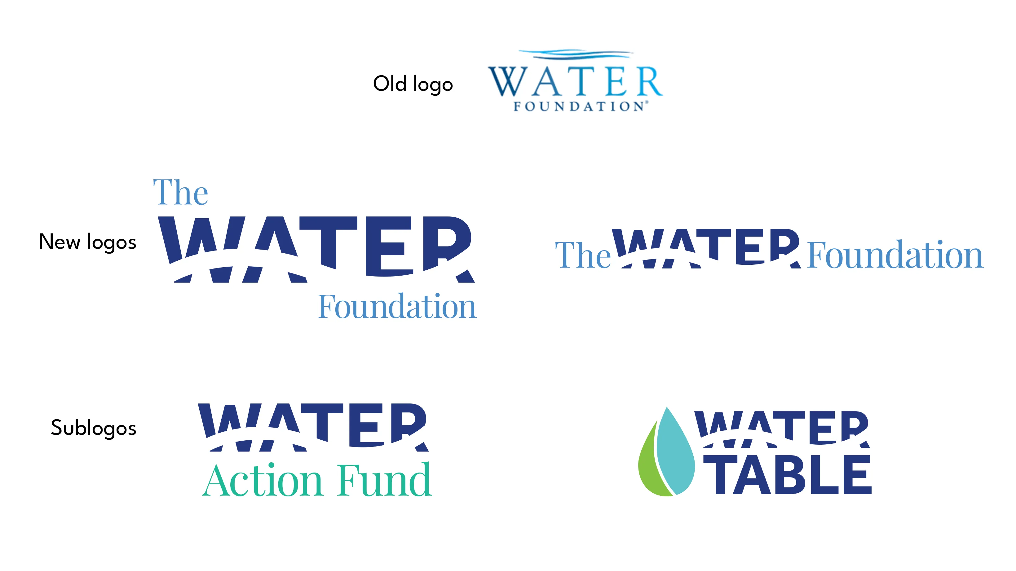
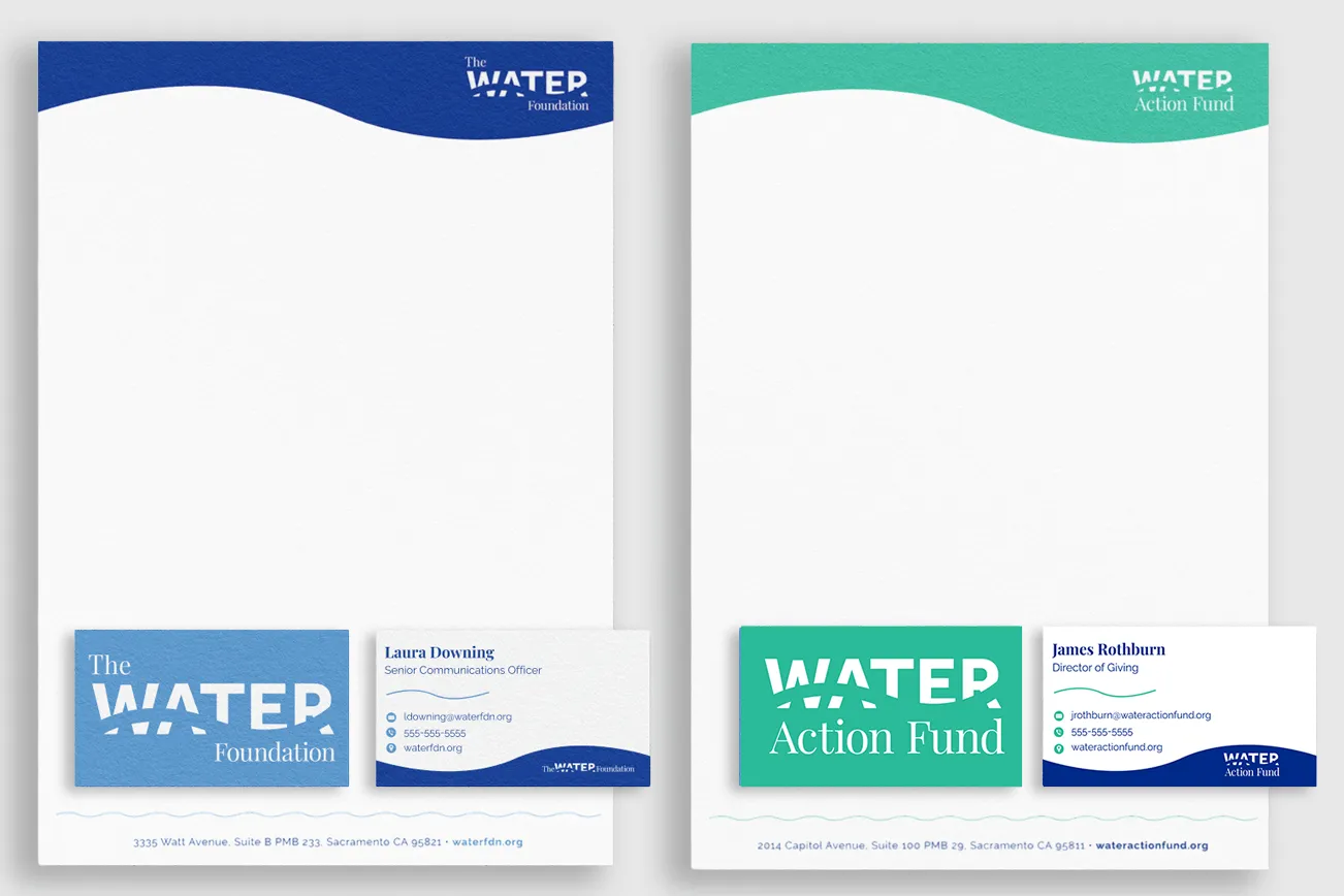
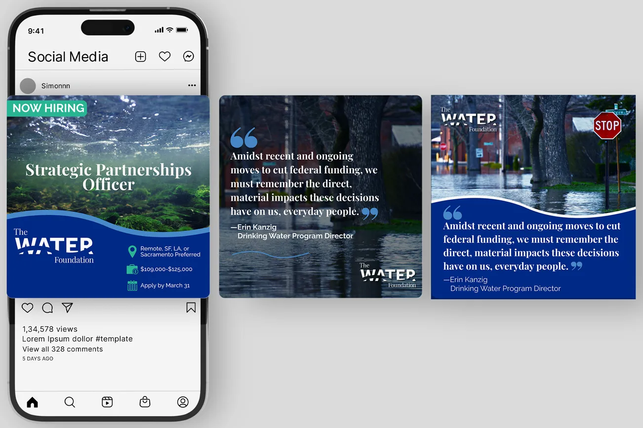
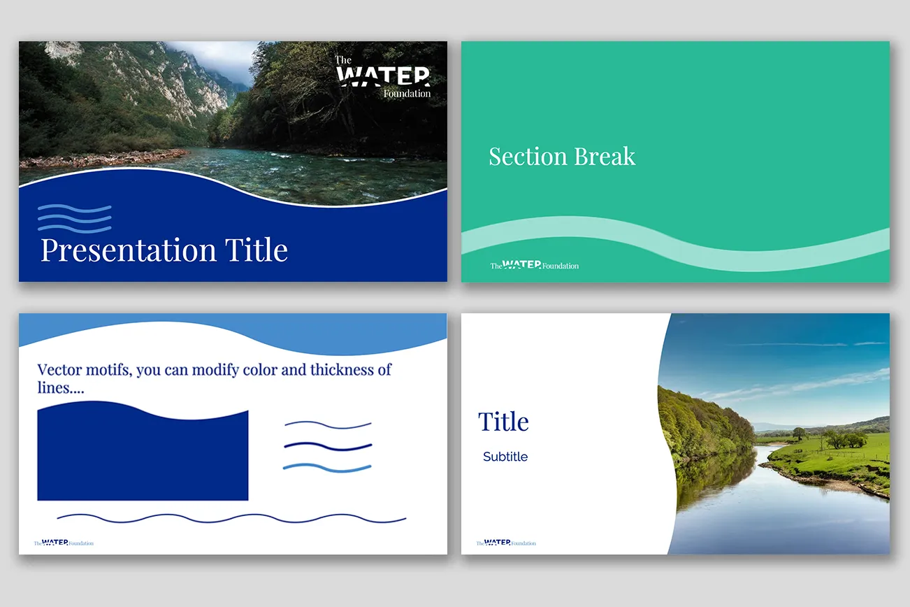
The Water Foundation works to ensure safe, clean, and affordable water for people, restore natural ecosystems, and build climate resilience across communities. 501c reimagined the brand identity for The Water Foundation and its sub-brands, Water Table and Water Action Fund. At the heart of the system is a custom wordmark where a flowing wave moves through the word WATER—a visual metaphor for how water connects every project and community the Foundation touches. The clean, calming color palette evokes fresh water and its vital role in nature and daily life, while ensuring flexibility across advocacy, research, and policy communications. To support consistent use, Kerstin created a full brand guide along with stationery, one-pager, and PowerPoint templates that made the system practical and easy to implement. From the core identity to the supporting tools, the brand is cohesive, memorable, and built to grow with the organization’s impact.
I am so happy I had the opportunity to work with Kerstin on my organization’s brand refresh. We had a lot of ideas — many of which were contradictory and not at all rooted in anything aesthetic or design focused — and Kerstin was able to beautifully translate that into our new brand package. Shedeciphered the thoughts of a big, opinionated team and easily dug into what was essential without sacrificing the modernity we wanted to achieve or the history we wanted to stay connected to. On top of delivering a top-notch final product, she was one of the kindest and most responsive vendors I’ve worked with.I chose Kerstin because of her design skills, but I’ll stick with her because of who she is, how she shows up, and how committed she is to ensuring her clients get exactly what they want and need."
– Erin M, Director of Communications


< Previous Project
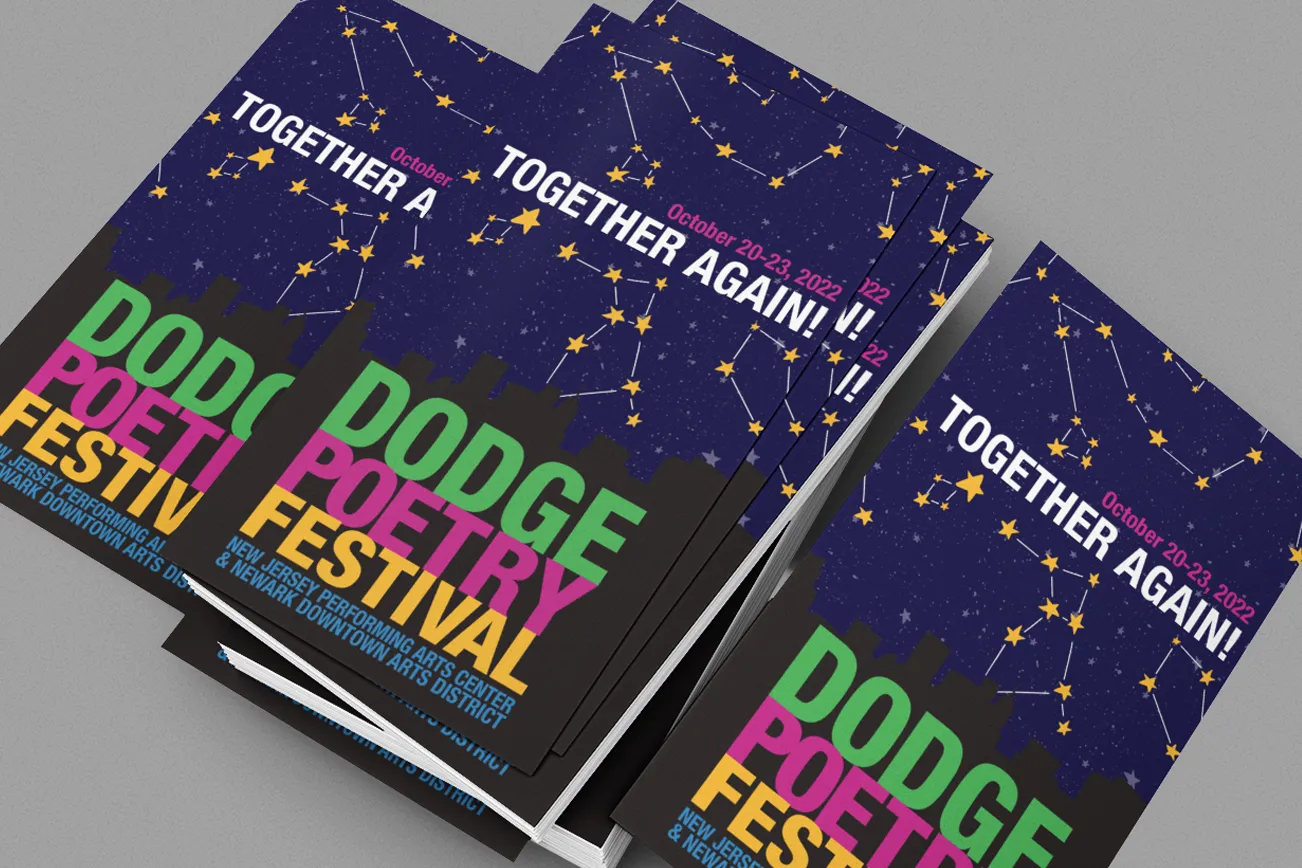
dodge poetry festival

Next Project >